
The Effective Implementation of Technical Analysis: Context & Probabilities, Not Crystal Balls
TA is not about have a magical crystal ball, it is about gaining context and placing probabilities slightly more in our favor.

I often read comments from investors stating things to the effect of “charts don’t work” OR “the chart isn’t relevant to this particular company because…..” and then they go on to explain why the fundamentals are different with their company (stock ZYX) and why everything will change in the future when a certain future event occurs for ZYX. It’s interesting to observe these comments because these same investors are plugged into the stock’s share price on a minute-by-minute basis virtually every single day. They watch the share price like they’re watching their vital signs from a hospital bed, but somehow the chart depicting the share price and trading volume can’t be of any use.
The reality is that some people have hijacked the art/science of technical analysis for their own purposes, usually by acting like they CAN predict the future. I believe it is through these kinds of misrepresentations that many people have become turned off to TA. In the process, they have decided that charts don’t offer much value to their investing process.
Let’s be clear.
There is a distinction between talking about market outcomes as certainties and/or high probability events, as opposed to talking about markets in terms of probabilities (usually not better than 60/40 likelihoods).
“What is not surrounded by uncertainty cannot be the truth.” ~ Richard Feynman

Without charts, price, volume, and sentiment analysis we might as well be blind men walking through a thick forest at night. Charts do not offer a crystal ball, they provide context. Context can be valuable when it is studied and interpreted by a keen eye.
Technical analysis is the study of markets through visual depictions of market participant behavior. Technical analysis does not infallibly predict the future. Far from it. In fact, it’s not meant to predict the future.
In its purest form, the implementation of technical analysis can help us to gauge risk, evaluate different potential scenarios, identify trends and attractive entry/exit points.
Charts provide an ongoing narrative, a history of market behavior. Nothing more, nothing less. It is up to us to effectively interpret the charts, and distill signal from noise. This is the tricky part, and this is where the mind of the beholder comes into play.
Instead of acting like TA can be used as a crystal ball, or dismissing it entirely, let’s take a look at two recent examples of how technical analysis can be implemented effectively:
AFM.V (November 2024 - March 2025)
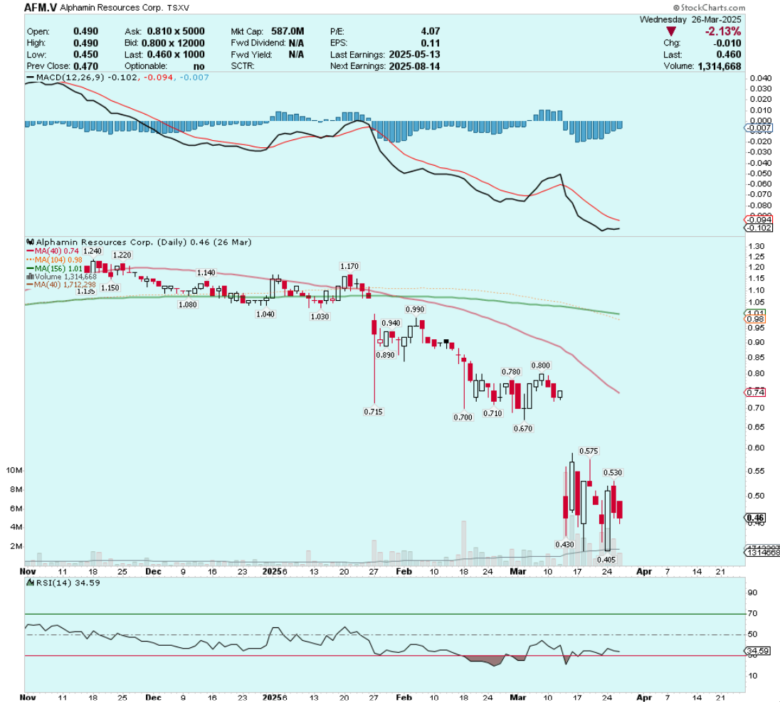
Alphamin Resources (TSX-V:AFM) had been mired in a pronounced downtrend since the end of 2024. That downtrend accelerated in March when the company announced that it had ceased mining operations in east-central DRC due to armed insurgent groups advancing to within proximity of its Bisie tin mine in the Walikale District.
I blogged about this trade as it evolved in real time: The Technical Analysis of Junior Mining Stocks: TA Is Bullshit
The situation in AFM at the end of March and early April was murky to say the least. However, by understanding the context of the chart (an extended downtrend that had now reached the washout capitulation stage) I was able to think past the negative headlines and investor fears. I began to notice that an accumulation was underway, evidenced by the fact the stock stopped going lower, and began moving higher.
This is an important point; bottoms begin with higher lows, tops begin with lower highs.
What happened next?
AFM.V (November 2024 - April 2025)
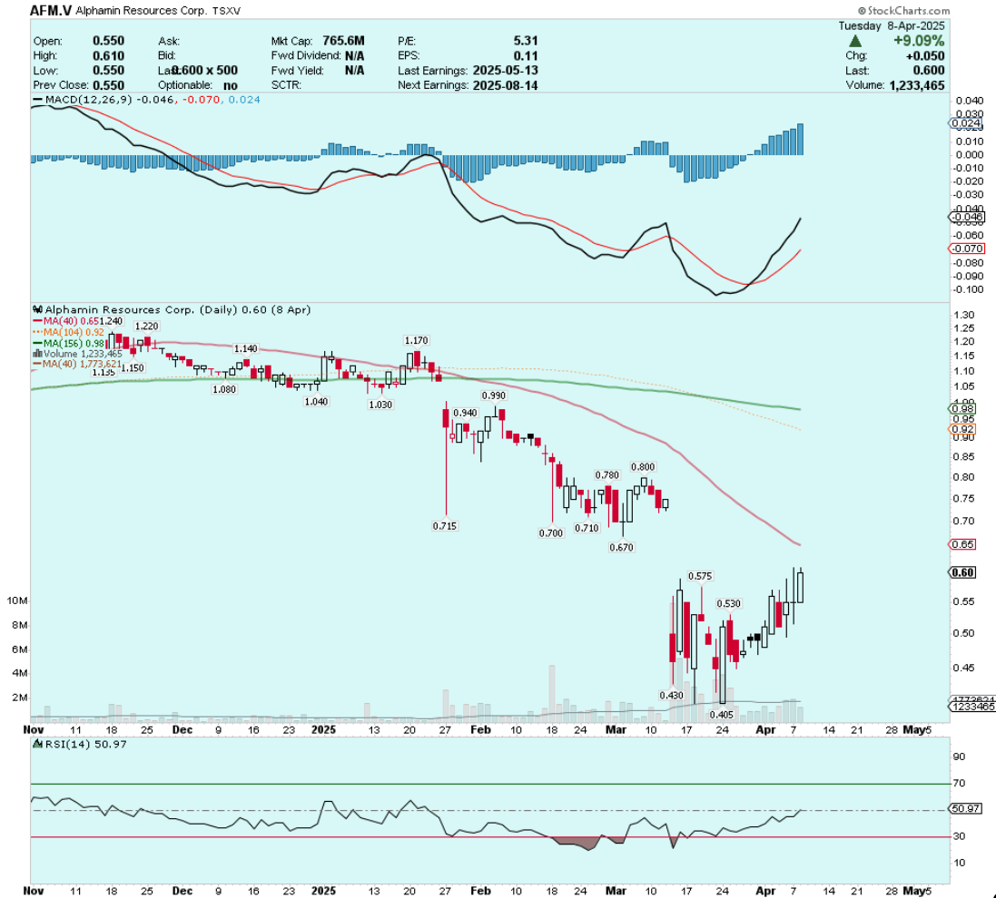
As global markets entered enormous turmoil in early April, AFM shares began moving higher. If there was a signal that positive news was on the way it was this stunning bullish divergence in AFM’s price/volume action relative to tumbling equity indices.
To put it into perspective, on Tuesday April 8th AFM shares rose more than 9%, BHP shares were down ~5% during the same trading session.
I didn’t have any special insights into M23 rebels and the conflict in the DRC, but I was able to read the tea leaves in the chart.
The end result of this trade setup was a large gap higher in AFM on April 9th, followed by a multi-week rally to nearly $1.00 per share:
AFM.V (Daily)
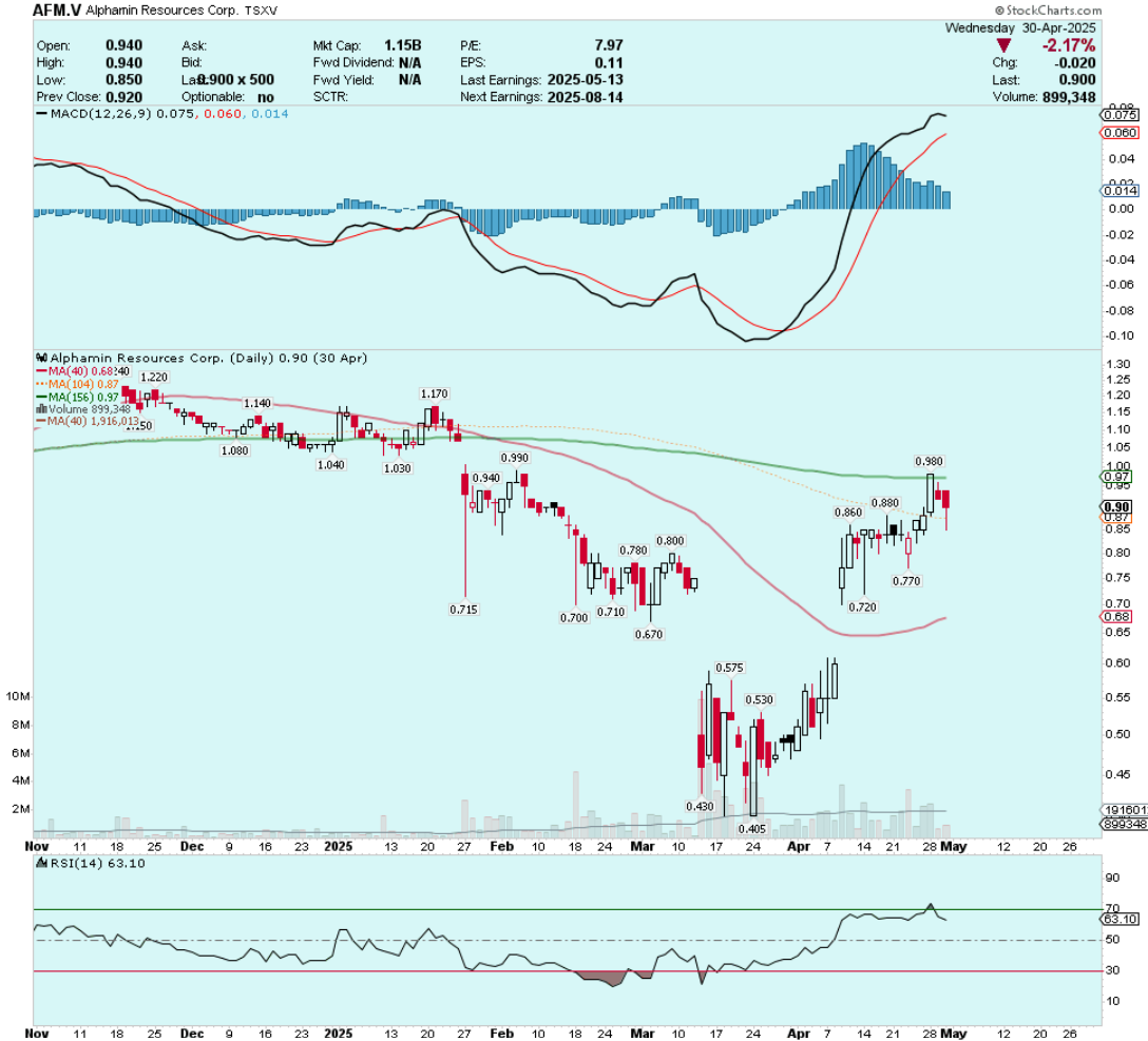
There was no magic involved with identifying this chart pattern bottom trade setup. It required knowledge of the company’s fundamentals, some geopolitics, and a keen observation of price & volume in Alphamin shares.
An ongoing trade setup is playing out in Albemarle (NYSE:ALB). I mentioned it in the Charts of The Week last Friday, and again in the Weekly Video. The context for the Albemarle trade is a grueling 30+ month bear market in the lithium sector, and the potential for a chart pattern bottom in the ALB chart.
This was the chart last week when I first identified the ALB setup, evidenced by an ascending triangle that was nearing completion:
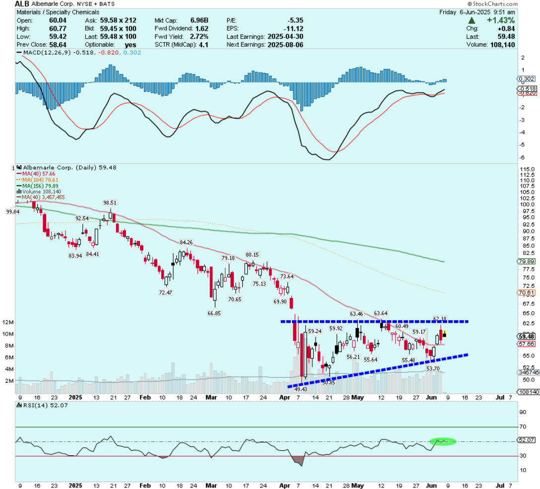
Nothing extraordinary. However, we do have the makings of a waterfall capitulation decline in early April, followed by a multi-week consolidation that has formed an ascending triangle. The technical indicators were constructive with daily-RSI(14) above the median line, and two higher lows in place since the April 8th bottom.
In 2022, ALB was a $300 stock. It has fallen more than 80% since its heydays during the 2022 lithium mania. Is that enough for a bottom to be at hand?
We don’t know, but I do like my chances of buying a stock that is trading below its book value with a strong cash position. The 16.1% short interest put me over the top and I took the trade last week.

Trades don’t usually work this well out of the gate, but when they do it’s definitely not a bad sign.
ALB (Daily)
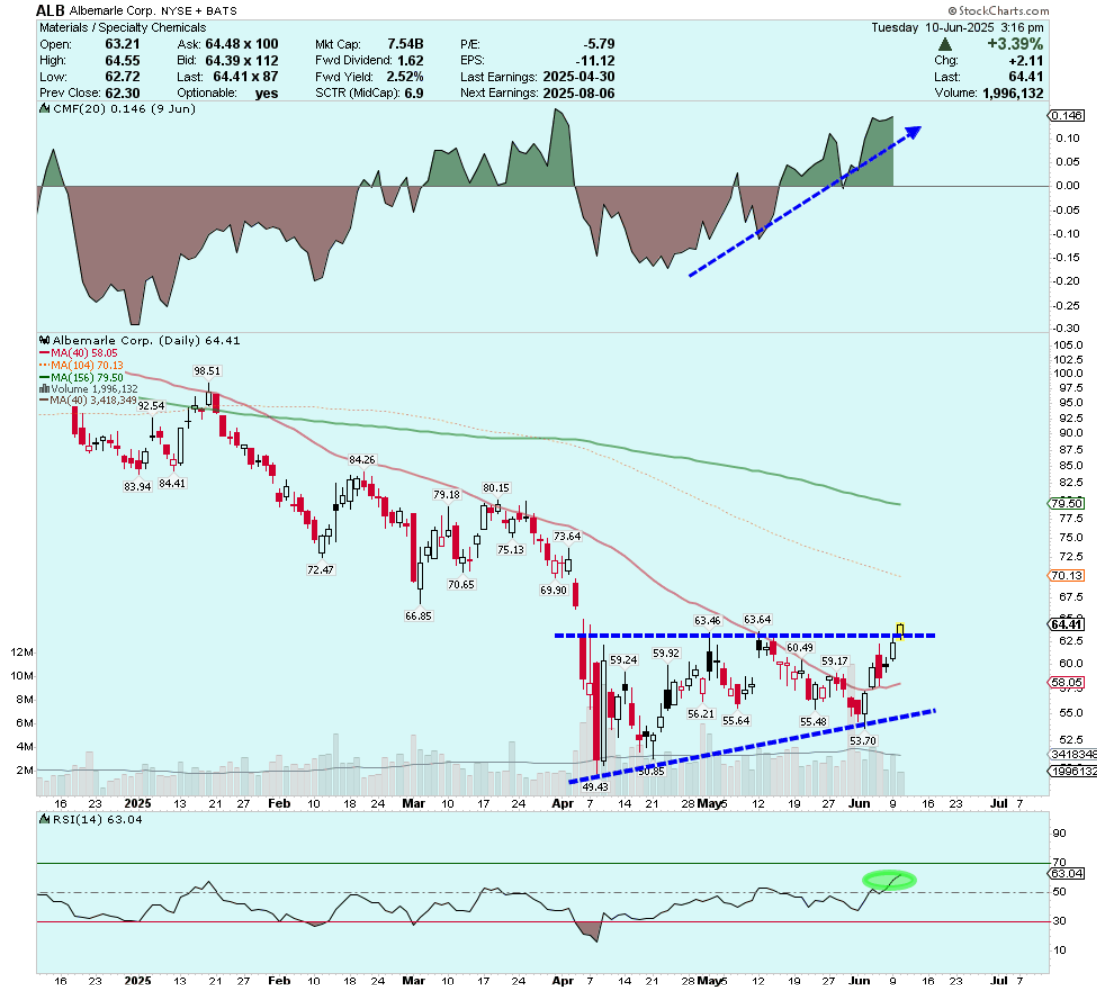
My initial upside target is the open gap at $66.50, then the 2nd open gap up at $72.25. It’s worth noting that Albemarle’s current book value (total assets minus total liabilities) lines up exactly with the $66.50 level.
Profit taking strategy and the art of allowing winning trades to ‘run’ is a topic for another day. However, I’ll leave you with a brief lesson on how to compute ‘measured move targets’ from completed chart patterns.
According to Bulkowski, ascending triangles achieve their breakout target 70% of the time. Let’s look at the following example to help compute the price objective from the ALB ascending triangle:
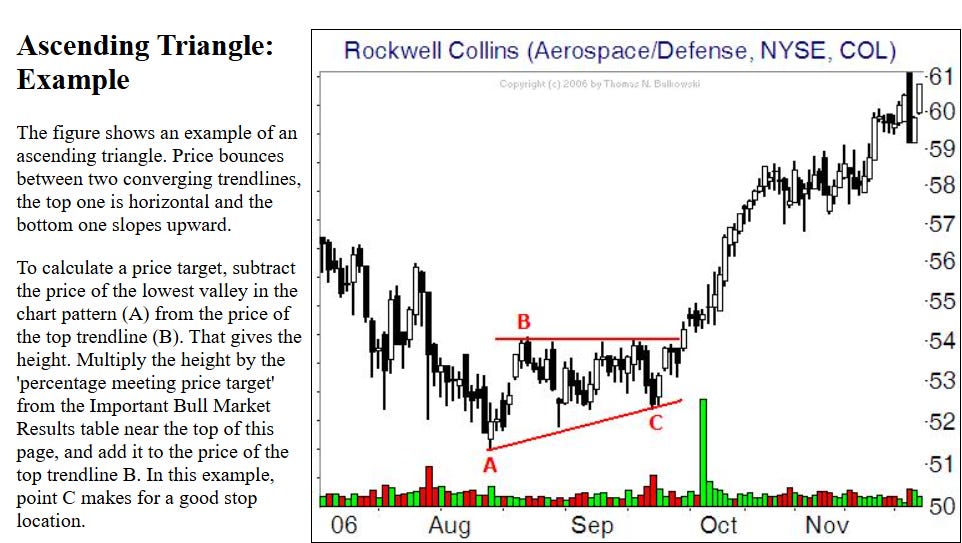
With ALB, the top ‘trendline’ is ~$63 and the lowest valley is ~$49.50. That gives us .70 x $13.50 = $9.45 - if we add the $9.45 to $63 we get a price target of $72.45.
Isn’t it remarkable how closely this target aligns with the 2nd open gap in the ALB chart?
Disclosure: Author owns ALB shares at the time of publishing and may choose to buy or sell at any time without notice.
DISCLAIMER: The work included in this article is based on current events, technical charts, company news releases, corporate presentations and the author’s opinions. It may contain errors, and you shouldn’t make any investment decision based solely on what you read here. This publication contains forward-looking statements, including but not limited to comments regarding predictions and projections. Forward-looking statements address future events and conditions and therefore involve inherent risks and uncertainties. Actual results may differ materially from those currently anticipated in such statements. This article is provided for informational and entertainment purposes only and is not a recommendation to buy or sell any security. Always thoroughly do your own due diligence and talk to a licensed investment adviser prior to making any investment decisions. Junior resource companies can easily lose 100% of their value so read company profiles on www.SedarPlus.ca for important risk disclosures. It’s your money and your responsibility.